Northstar Product
2026
Clarity and control to how teams spend company money.
Role Product Designer
Timeline 2 weeks
Team Solo
Skills Product design UX research Prototyping
Overview
Making company spend simpler.
Northstar is a B2B finance platform designed to help companies manage spending from request to transaction.
I started the project as an exploration of how a modern finance product could make company spending easier to request, approve, allocate, and track.
The product brings together spending requests, approvals, allocations, virtual cards, transactions, and reporting into one system.
My focus was primarily on the spending and approval experience, particularly the relationship between employees requesting money and finance managers responsible for approving it.

Problem
Making sense of spending across people, teams, and budgets.
Company spending can become complicated quickly.
An employee needs money for something. A request has to be submitted. Someone needs to review it against company policies and budgets. Once approved, the money needs to be allocated and made available for spending.
Each step introduces opportunities for confusion.
What can I spend?
Why was this request approved or declined?
Is it within policy?
Where did the money go?
What happens after approval?
I wanted to explore how these questions could be answered directly within the product rather than forcing users to piece information together across different parts of the system.
Solution
Designing for two sides of the same transaction
I designed Northstar around a connected spending lifecycle:
Request → Review → Approval → Allocation → Spending → Tracking
Rather than treating requests, cards, and transactions as separate features, the product connects them.
An approved request can become an allocation.
An allocation can have a virtual card attached to it.
Transactions made with that card are then associated with the allocation.
This creates a clear relationship between why money was requested, how it was approved, and how it was eventually spent.
Send request
Making it simple for employees to ask for what they need
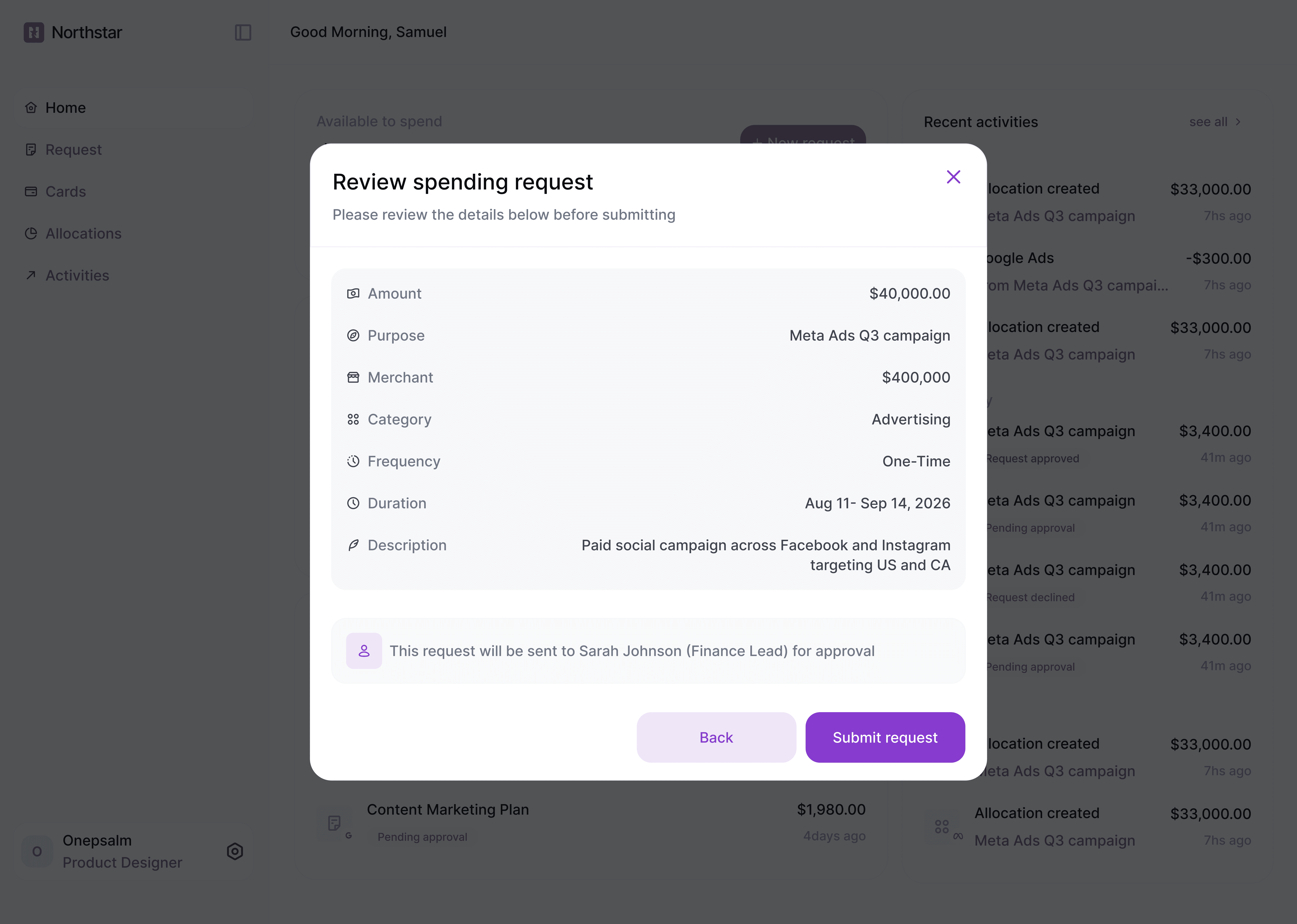
The request flow is designed to give employees a straightforward way to ask for company spending.
Instead of simply entering an amount, the request captures the context an approver needs to make a decision:
Amount
Purpose
Merchant
Category
Frequency
Duration
Description
The goal was to make the request useful before it reaches the approver.
The more context the employee provides, the less work the finance team has to do later.
Request approval
Giving approvers enough context to make the right call.
The approval experience was one of the more interesting parts of the project.
An approver isn't just deciding whether something is approved. They need enough context to understand whether the request makes sense.
The approval drawer brings together the request details with decision context such as:
Department or marketing budget
Existing employee spend
Policy status
Previous requests
This means the approver can evaluate the request without leaving the workflow.
I also separated request status from policy status.
For example:
Pending approval
Within policy
These communicate two different things. One tells you where the request is in the approval process, while the other tells you whether it complies with company policy.
After approval, the request becomes an allocation and the approval actions disappear from the request view. The allocation can then be managed from its dedicated page.
View allocation
What happens after a request gets approved.
Approval shouldn't be the end of the story.
Once a request is approved, Northstar creates an allocation that becomes the actual spending container.
The allocation page brings together:
Available to spend → Virtual card → Transactions → Allocation details
This gives the user a clear picture of how much money remains, what the money can be used for, and what has already been spent.
The connection between the approval and allocation was particularly important to me.
The user shouldn't have to wonder:
“Okay, this was approved. Now where did the money go?”
The allocation is the answer.
Cards
A card for every tier.
I wanted the virtual cards to feel like more than generic payment cards.
Northstar has three card tiers, with the visual treatment reflecting the spending limit attached to an allocation.
Gradient → Silver → Gold
The gradient card represents the lower spending tier, silver represents a higher limit, and gold is reserved for the highest spending tier.
This creates a simple visual hierarchy that lets users recognize the relative scale of an allocation at a glance, while giving the cards a distinct identity within the product.
The cards are also directly tied to their allocations, with controls for things like merchant restrictions and transaction limits.
So the card becomes more than a way to spend money. It becomes a visual representation of the allocation behind it.
Other screens
A few more frames.
A selection of stills from across the product, showing some of the other screens and states I explored while designing Northstar. The core experience is captured in the prototypes above.
Different roles, different priorities.
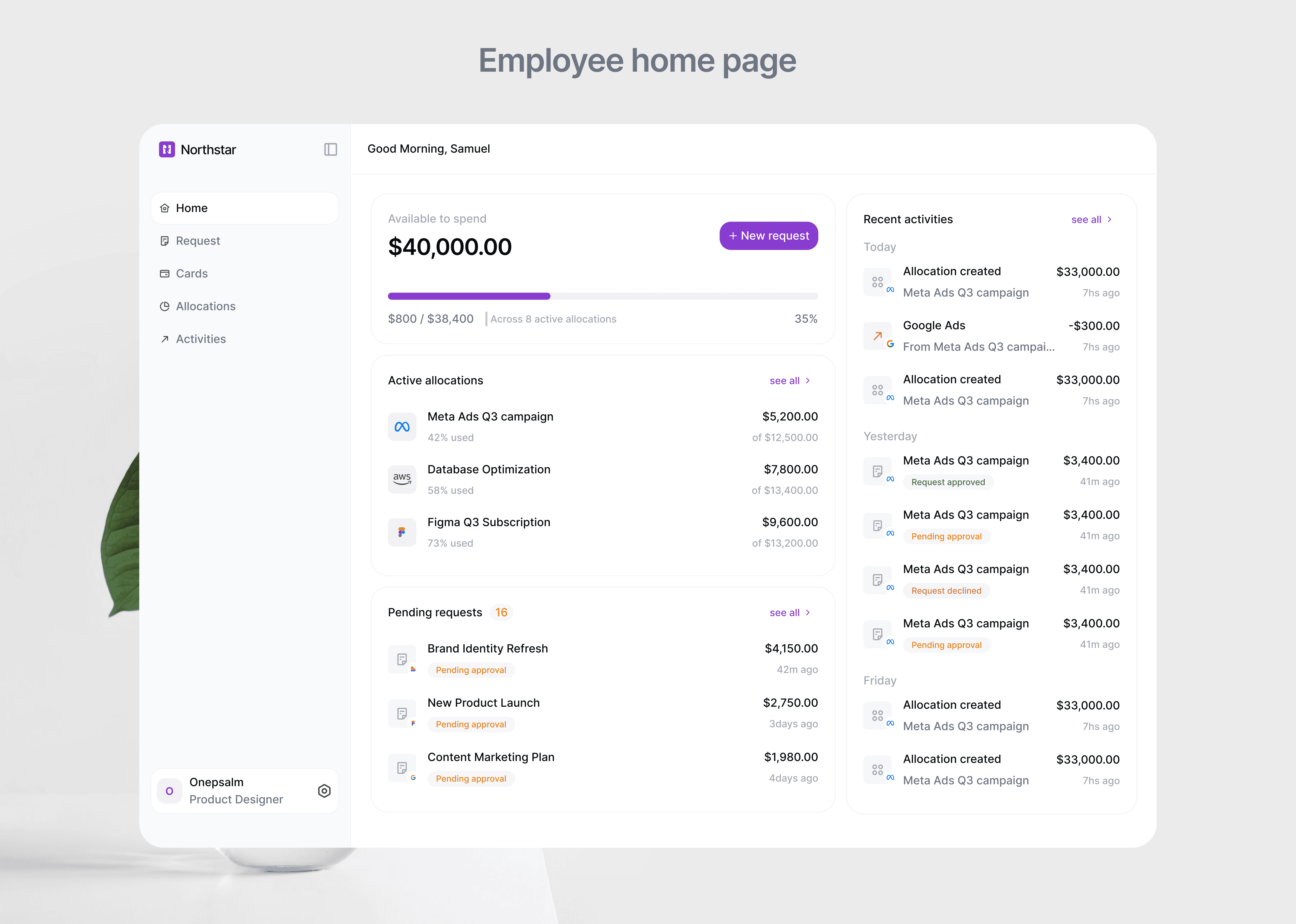
The employee and approver homepages are designed around what each person actually needs to know when they open the product.
Employee home
The employee's home is focused on their available spending and activity. They can quickly see what they have available, what they've spent, and the state of their requests without having to dig through the rest of the product.
Approver home
The approver's home is more focused on the company's money. Instead of duplicating the requests page, I used the space to surface a broader view of company spending, giving them a quick sense of allocations, spend, and where money is going before they go into individual requests.
The goal was to avoid making both homepages feel like the same dashboard with different permissions. The role determines what deserves attention first.


Reflections
What the process taught me.
This project reminded me that simple solutions can go a long way, especially in organisations dealing with multiple departments, budgets, and lots of numbers. Even a relatively simple feature can remove a lot of friction.
It also made the idea of an MVP feel much more real. Northstar could have included much more: more advanced reporting, policy configuration, approvals with multiple levels, notifications, reimbursements, accounting integrations, and more. But knowing what not to build was part of the design.
And finally, I realised how much the little decisions matter. The flows, states, interactions, and even tiny component details all add up to shape the experience.