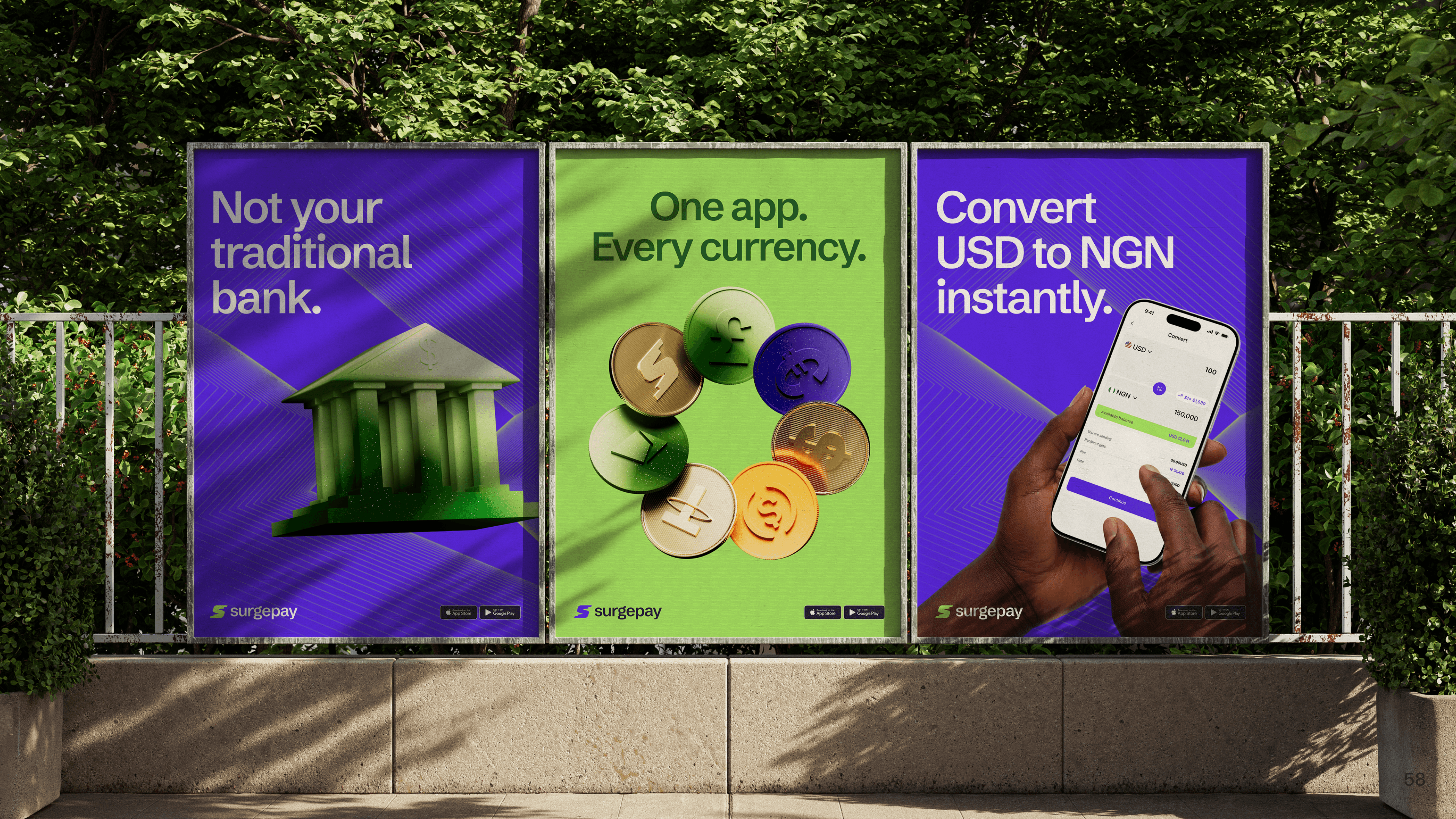
SurgePay Branding
2026
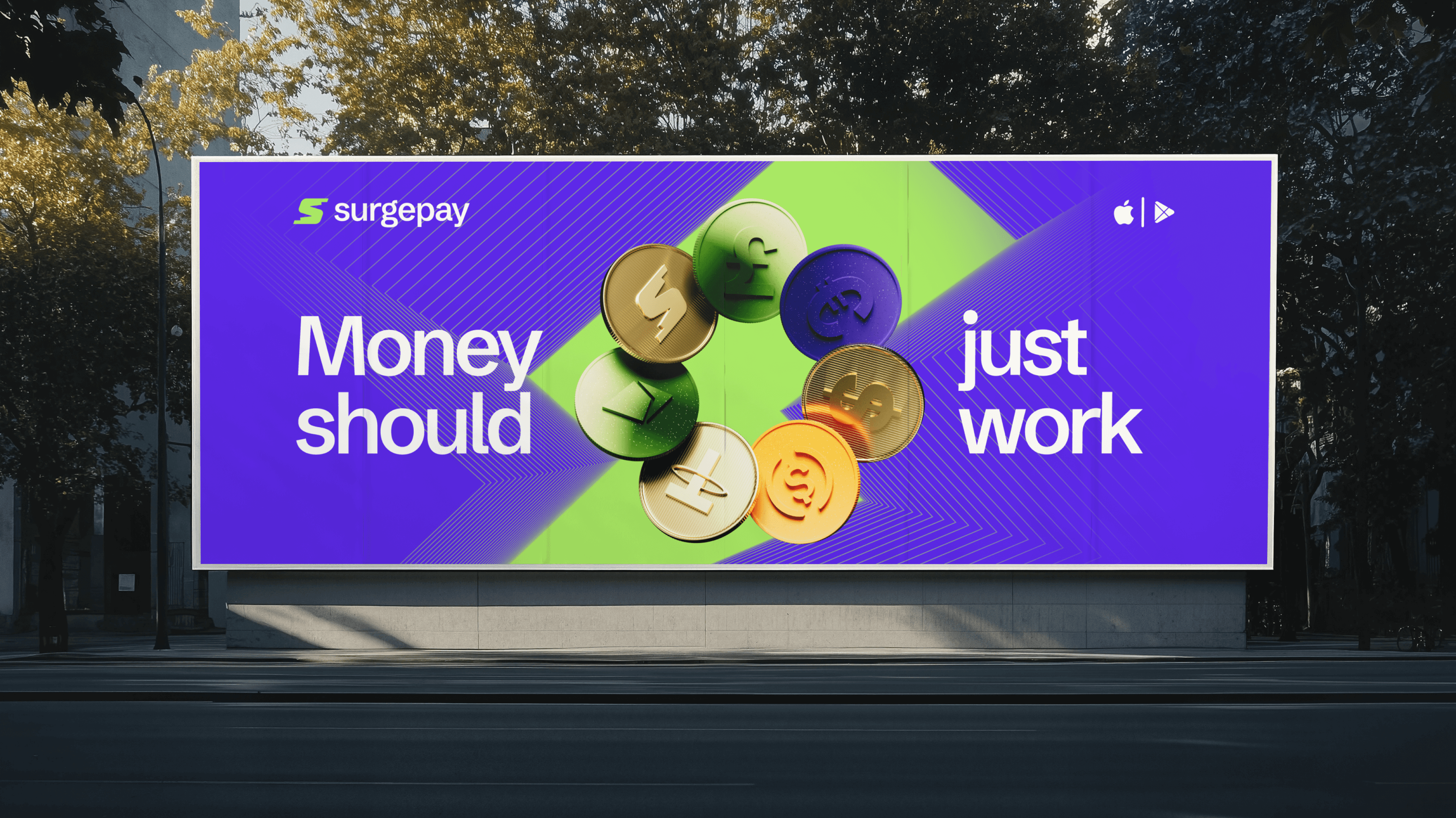
Money should just work.
Role Creative director Lead brand designer Motion designer
Timeline 12 weeks
Team Osunleke Samuel John Chuka Emmanuel Asibe
Skills Brand strategist, Brand designer
Overview
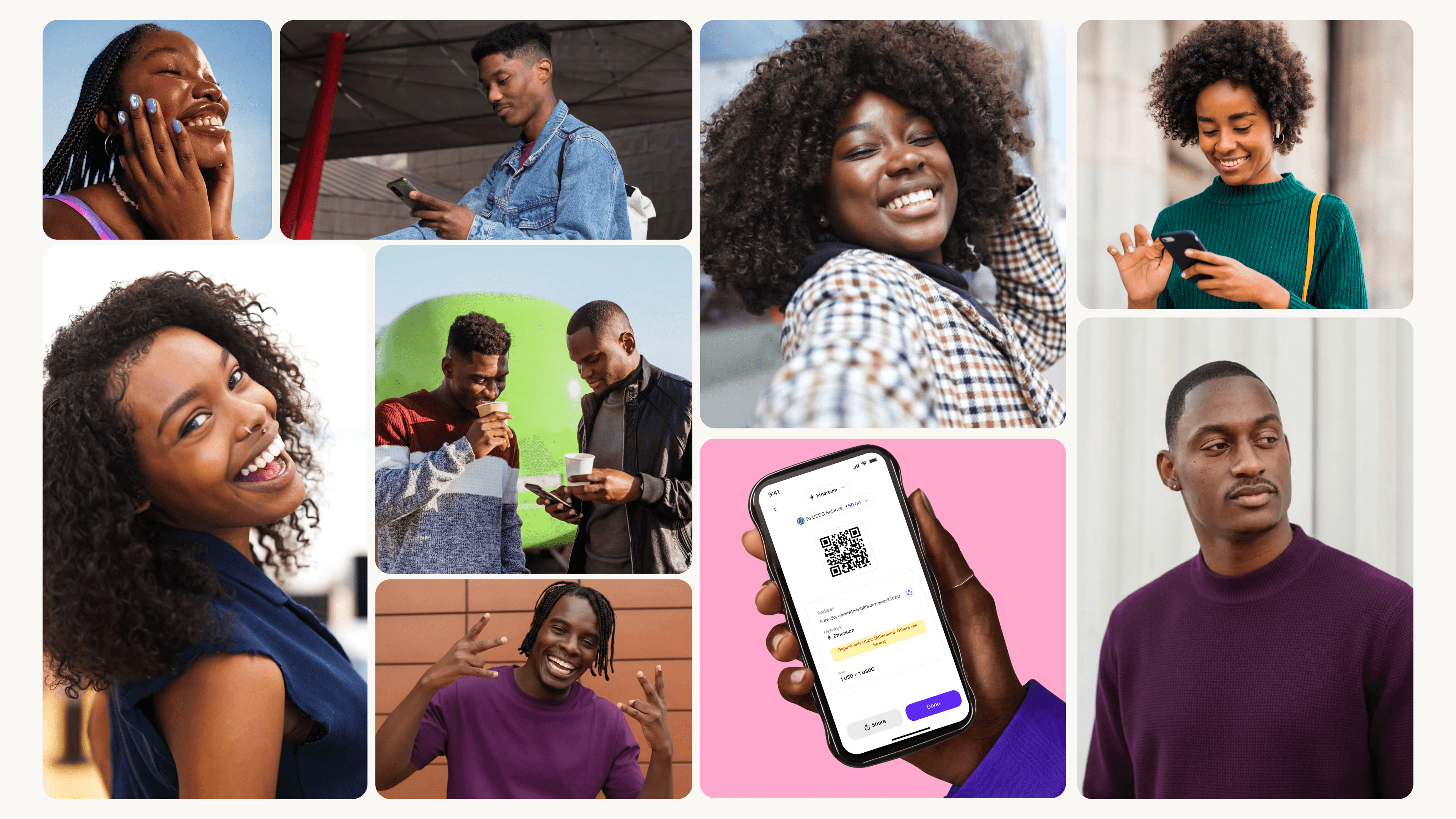
SurgePay was built for global Africans earning in foreign currencies, supporting family back home, and moving money without borders.
Nigeria's fintech market is crowded with brands that look like each other navy blues, generic lightning bolt marks, and headlines about speed. SurgePay needed to break from that visual language entirely and signal something more complete: not just a payments app, but a full financial infrastructure for how Africans actually move money globally.
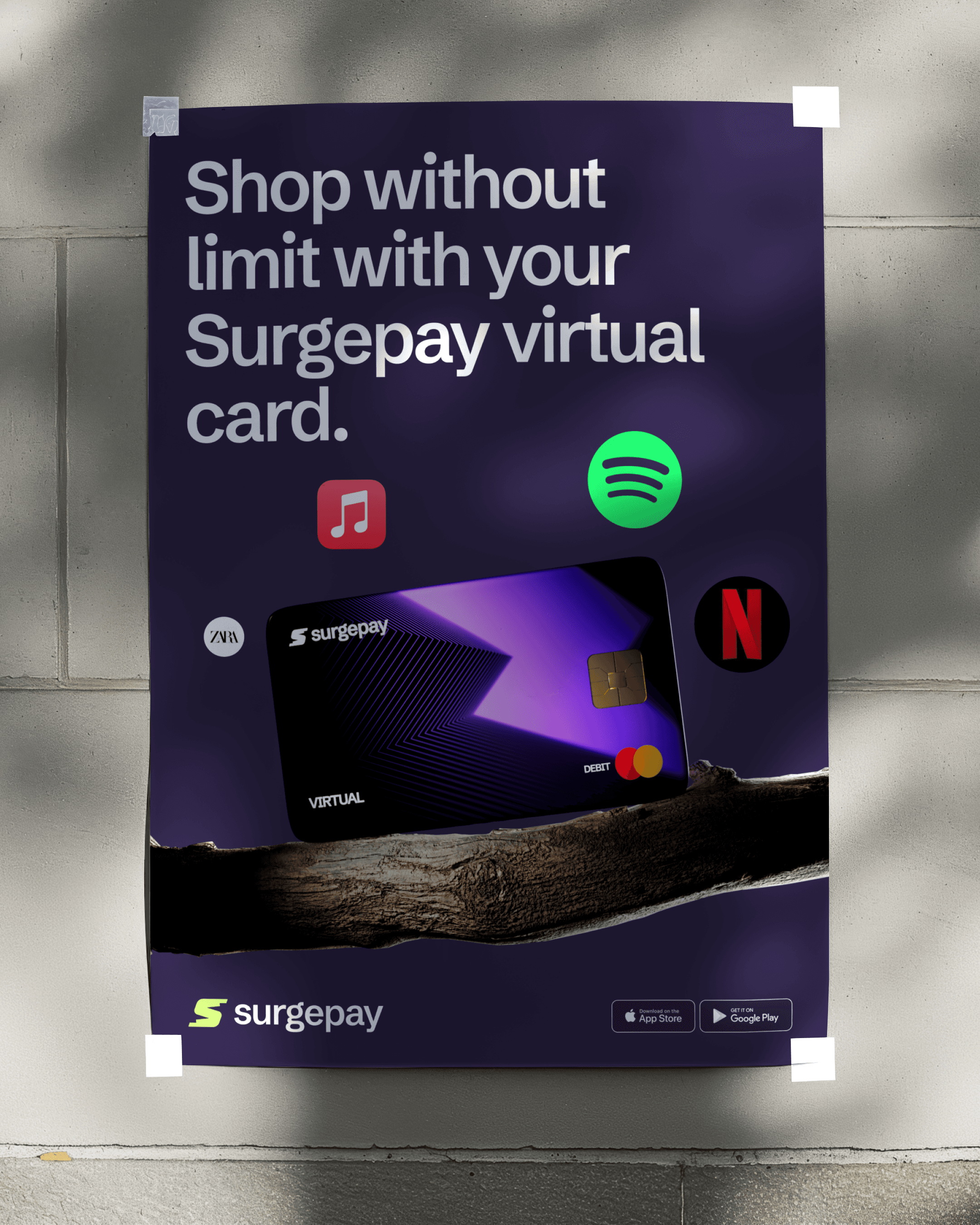

Strategy
My Approach
The strategic foundation was a single promise, "money should just work," and we built the entire identity around what that feels like in motion. Not the absence of friction, but the presence of precision. We called it engineered energy.


Logo
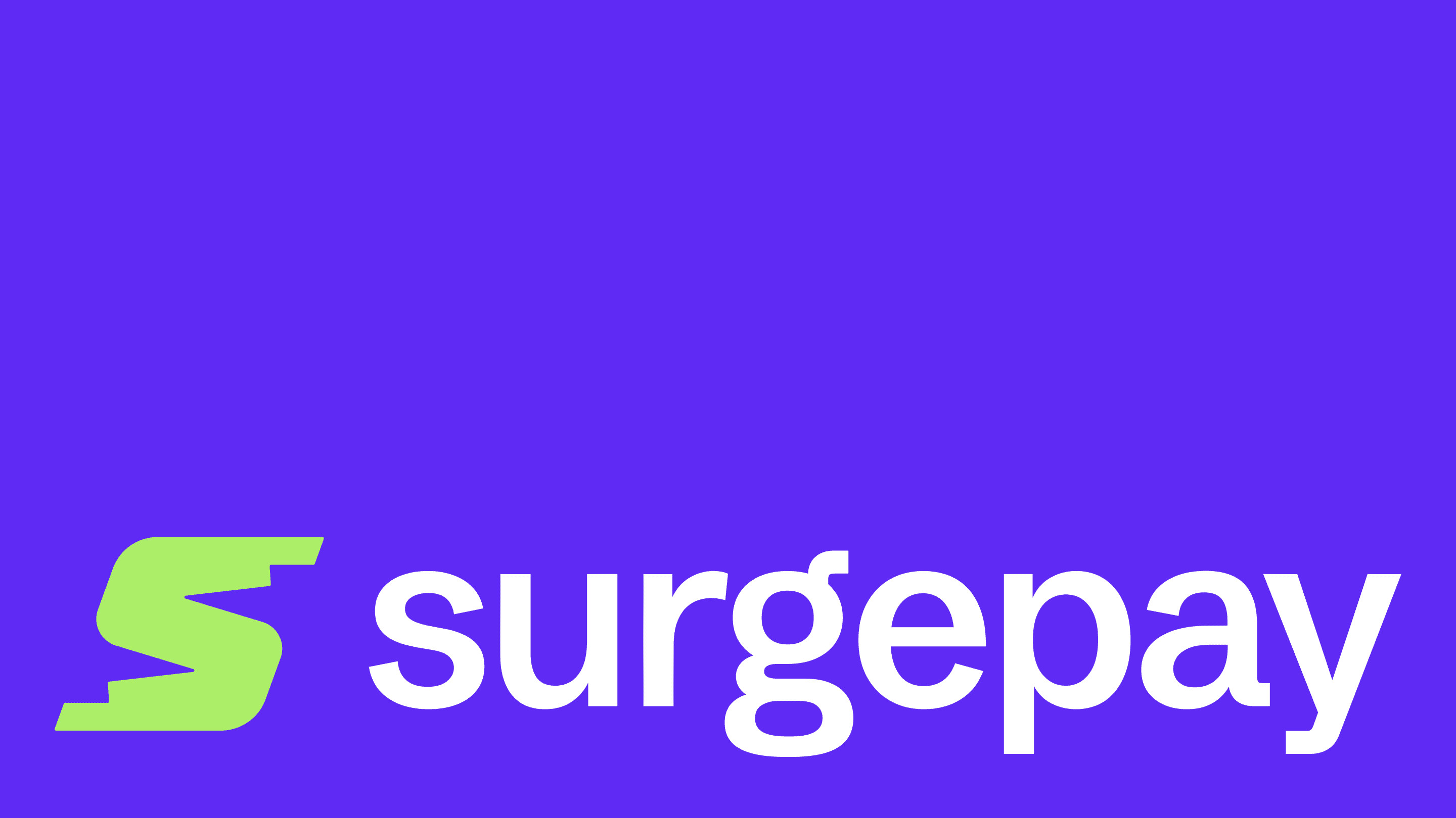
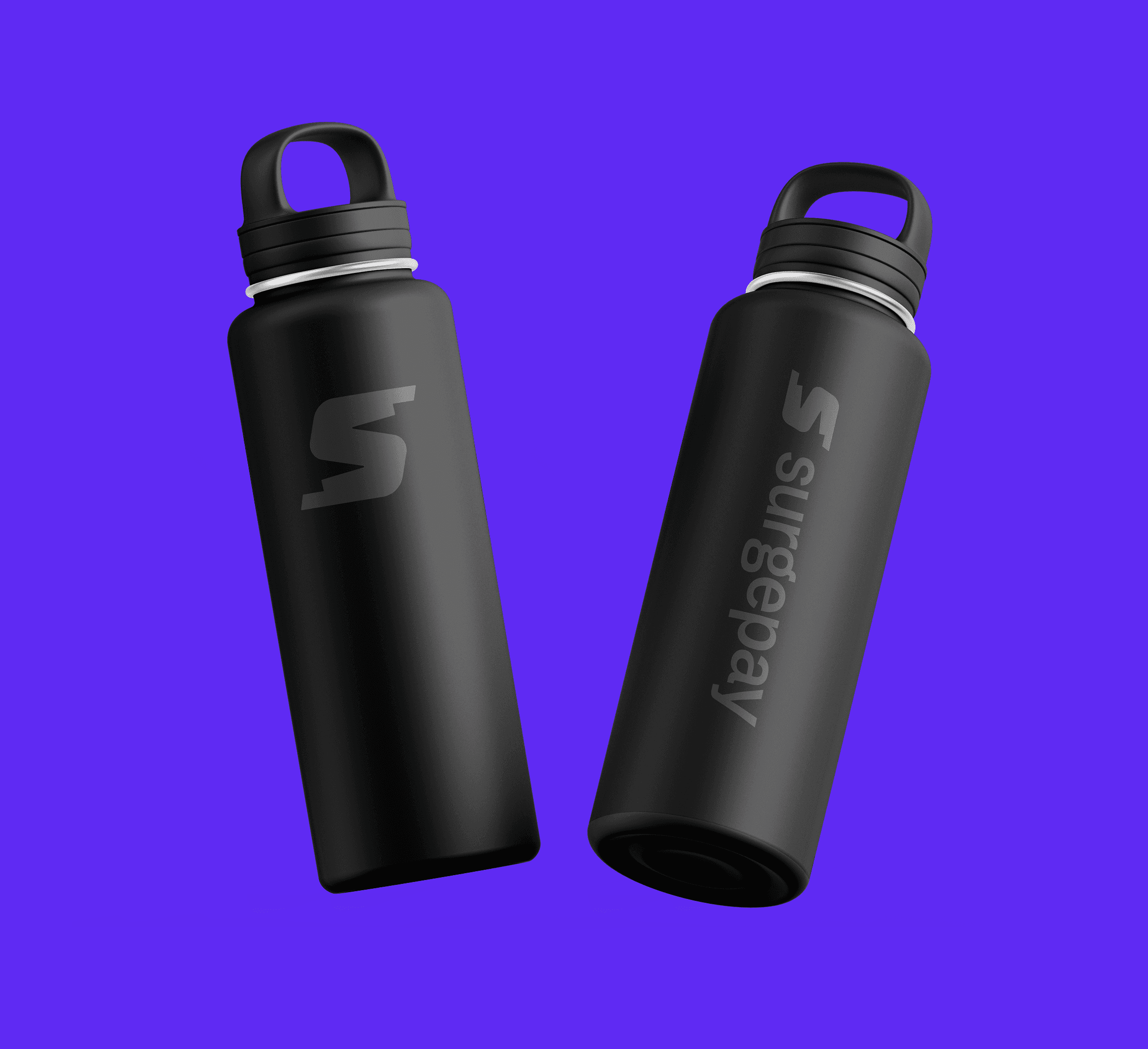
The Kinetic S came from that idea directly. Rather than reach for the obvious fintech tropes, lightning bolts, upward arrows, globe marks. We looked at what speed and structure actually look like in geometry. The result is a symbol with an aerodynamic slant and stepped cuts that suggest both velocity and structural integrity.


System
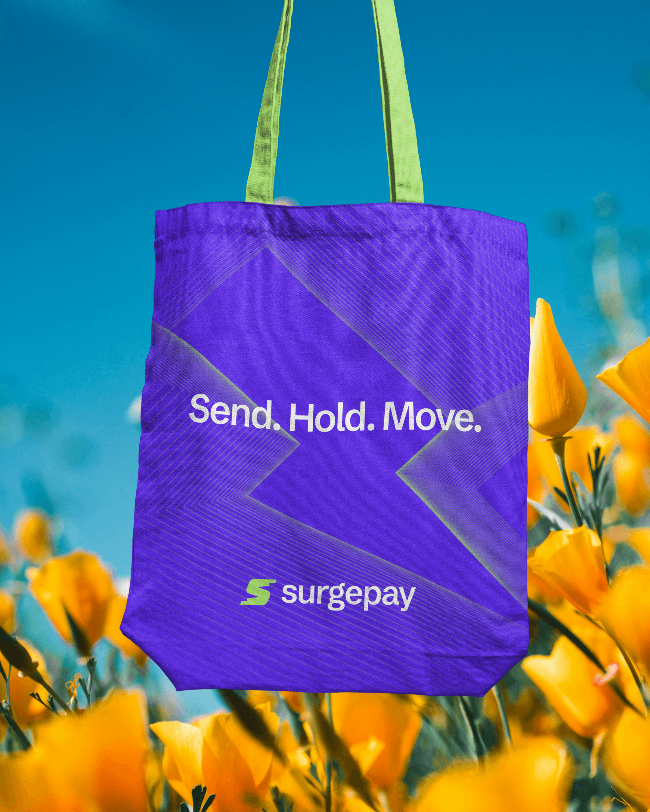
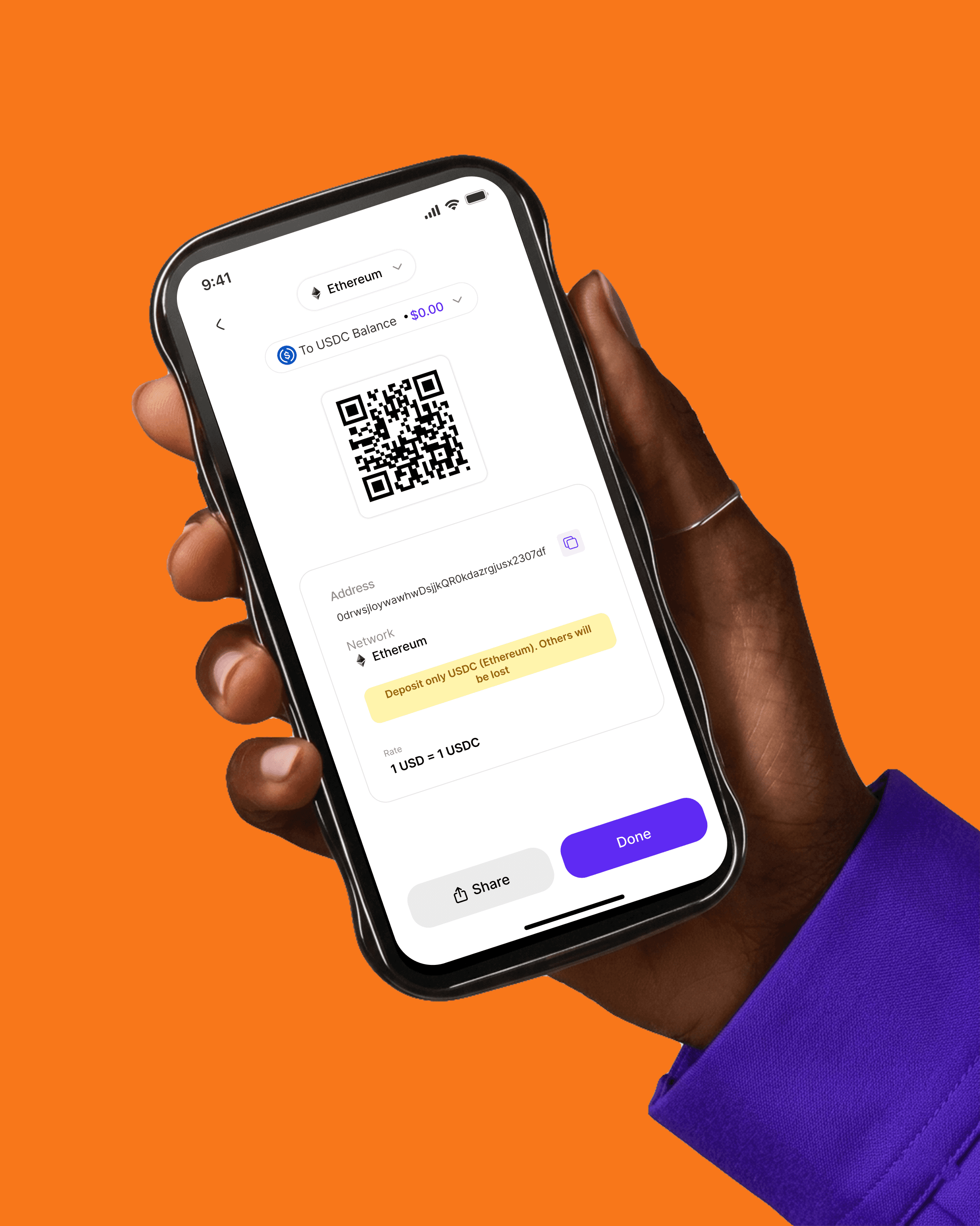
Schibsted Grotesk handles typography globally readable and professional. The color system presents Electric Indigo for authority and a neon accent for forward momentum, then expands into a secondary range that gives the brand flexibility across every touchpoint without losing coherence.
The 3D asset library and illustration system were built to the same standard: every object the stablecoin coins, piggy banks, checkmarks, umbrellas carries the brand's geometric logic. Dimensional where it needs depth, illustrated where it needs warmth. The motion system, built in Cavalry and aftereffects, traces back to the Kinetic S: the same tension, the same release, animated.